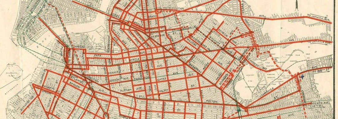
Standard city cycling maps tend to show where there is physical infrastructure: trails, bike lanes, and that sort of thing. For instance, see Berkeley’s map (pdf) of bike lanes and bike boulevards. This is useful information to have, but it falls far short of ideal, because a narrow bike lane on a 35-mph road is a very different thing from a wide lane on a 25-mph residential street. In fact, in many cases, the street with the bike lane will not be the safest or easiest path for cyclists to take.
I’ve made a map which attempts to answer the question: given your personal stress threshold for dealing with traffic, how can you get from here to there on a bike? I was inspired to do this after seeing a similar method applied to Austin, TX in this blog post at the Green Lane Project.
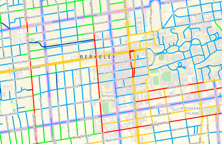
Different colors designate different levels of street comfort and safety for cyclists, from blue (LTS 1, for the kids) to red (LTS 4, for the fearless). Click through for a fully interactive map!
Click on the map for an interactive version, where you can show or hide different street classifications individually.
One fun thing is to turn off the LTS 2, 3, and 4 layers, leaving only the blue routes visible. Berkeley becomes a largely disconnected network of islands, with major streets functioning as barriers. The bike boulevards (shown in purple) alleviate this to some degree, because they usually get signalled intersections.
Read on for much more discussion, including a definition of LTS!
A Taxonomy of Cyclists
The idea guiding this map is a taxonomy of bike riders (and non-riders) developed by Roger Gellar, the bike coordinator for Portland, OR. The basic idea is that there are four types of bike riders. The following descriptions paraphrase heavily from that article.
Gellar estimates that less than 1% of Portland’s population are “Strong and Fearless.” These are the people who ride bicycles in most of the U.S. They are unafraid to use roads with high-speed traffic and narrow shoulders, or to simply take the lane. I think of this group as made up of a combination of people who wear lycra and NYC bike messengers. They’ll ride streets regardless of infrastructure and surface conditions, and being a “bicyclist” is part of their identity. These folks are largely male.
The second group is “Enthused and Confident,” who make up something like 7% of the population. These are the people in Portland who have been attracted to biking as the city has developed its bike network over the last 16 years. They will share the road with traffic but prefers separated infrastructure. This group is the reason why many college towns have relatively high cycling rates: they cycle because it’s a cheap and practical means of transportation, but also because they tend to be overconfident young males who are not so concerned with safety.
A third group, comprising 60% of the population, is “Interested but Concerned.” They wouldn’t mind riding — they probably enjoyed biking when they were a kid, and don’t mind using separated trails. But they’re not confident enough to use city streets, if they even own a bike — they know what will happen if they get hit by a car moving at 35 mph, and they’re understandably uncomfortable to interact with traffic moving at that speed. I don’t know how the 60% figure was arrived at, but it’s worth mentioning that in Amsterdam, close to 40% of trips are made by bicycle (as of 2008) and 85% of the population reports riding a bike in the last week (as of 2003; pdf). Thus 60% of the population may be an underestimate.
Finally, “No Way, No How” makes up about a third of the population. These people just won’t bike, for various personal reasons.

A depiction of the cyclist taxonomy. Clockwise from top left: “Strong and Fearless” (cite), “Enthused and Confident” (cite), “Interested but Concerned” (cite, which has many other excellent pictures of cycling in Amsterdam) and “No Way, No How” (cite).
Level of Traffic Stress
A report, Low-Stress Bicycling and Network Connectivity (Mekuria et al, 2012) from the Mineta Transportation Institute tries to connect the rider taxonomy above with the physical characteristics of roads. The basic idea is simple: a segment of road with higher speeds and more travel lanes in each direction is less comfortable for cyclists. Conversely, bike lanes can make an stressful road less so.
They break things down into four levels of stress, which correspond to various cyclist types in the taxonomy above. Specifically, LTS 4 is intended to correspond roughly to “Strong and Fearless,” LTS 3 to “Enthused and Confident,” and LTS 2 to “Interested but Concerned.” Finally, LTS 1 is meant to describe roads that an eight-year-old and an eighty-year-old should be able to safely ride.
Stressful intersection crossings contribute to the level of stress of adjacent road segments. Thus, it’s appropriate to think of this map as showing the network connectivity for Berkeley cyclists with different stress thresholds, rather than strictly showing the stress level for each segment.
I won’t go further into the details about the approach. If you’re interested, see the paper; I followed their method pretty closely. A couple of small things:
I made one small modification to their approach. For instance, I decided that a bike lane could never increase the level of stress of a segment. This applies to Channing (east of MLK Way), which has a bike lane which is narrow enough that it would qualify for LTS 2. However, if it didn’t have a bike lane, it would only have LTS 1, because it’s a two-lane residential road with a speed limit of 25 mph. I chose to give it the more generous classification.
On vehicle speeds: all speed limits on streets in Berkeley proper are 25 mph, except for Sacramento St. and San Pablo Ave, which are both 30 mph. (The freeway and frontage roads are also faster, of course). However, this doesn’t fully capture vehicle speeds in practice. I bumped MLK, Ashby, and Dwight (east of MLK) up to 30 mph, consistent with my sense of how fast people are actually going. I also bumped Tunnel Rd. to 35 mph, as it basically serves to feed traffic from Highways 13 and 24 into town, and in my experience people haven’t yet slowed down to the supposed 25 mph speed limit at that point.
Disclaimers and Caveats
Berkeley cyclists, use this map at your own risk! I do think it’s way better than what exists currently, but it’s definitely not perfect.
A useful modification which would bring the scheme a bit more in line with reality would be to account for traffic volumes. A 25-mph road with 250 cars per day is very different from one with 20,000 cars per day, from the perspective of a cyclist. Another idea (albeit a bit orthogonal to this method) would be to account for topography, which I don’t attempt to do at all with this map.
I also didn’t spend too much time making sure that the streets up in the hills are properly coded (basically all the curvy streets to the east and north in the map below). If you’re biking up there, you either know what you’re doing or you’re not too familiar with Berkeley, because they are steep.
More importantly, I think their classifications are somewhat optimistic. I wouldn’t let my (hypothetical) kid ride on parts of the LTS 1 network. And although I’d self-classify as a LTS 3 cyclist, I’m uncomfortable biking on some purportedly LTS 2 streets such as College Ave.
Finally, it’s probably worthwhile to keep Berkeley’s bike boulevards in mind (in purple on the map). They may not be any physically different than neighboring residential streets, but they frequently get some traffic calming and diversion measures. Plus, drivers on those streets are probably more likely to be watching out for bikes.
Data and Tools
This map would have been impossible without the GIS shapefile of the Berkeley street network available at the city’s website here, which includes street widths (a high fraction of which were accurate). It is a bit out of date but still incredibly useful. Thank you, Berkeley!
Existence of bike lanes was taken from both Google Maps and the city’s bicycle network map, available here (pdf). Both were wrong or out-of-date in some small ways. Bike lane widths were measured by hand as accurately as is feasible via the Google Maps Labs “distance calculator” and satellite view. Similarly, whether or not intersections are signalized was confirmed using Google Maps Street View.
The data was analyzed and massaged in QGIS. The map tiles were created via the incredibly useful TileMill, using a base layer from OpenStreetMap, the Wikipedia of map data. I used the Javascript library Leaflet to serve the map.
Needless to say, this would have been a much more difficult project as recently as five years ago. We live in incredible times.

July 24, 2017 at 4:15pm
Hi there,
This is fantastic! I would love to create a similar map for my town as well. Unfortunately I am not too familiar with the process to do so. Is there any more info you can provide on how you went from OpenStreetMap data through the steps to creating such a map? Any info or guidelines are very much appreciated.
Thanks so much for your work, it’s an inspiration!
Best regards,
Alex S
July 27, 2017 at 12:26pm
Thanks for your interest! Unfortunately, since it’s been 4.5 years (and this was only done as a fun side project), the skills have atrophied.
Some documentation for importing the OSM base map layers into TileMill can be found here: http://tilemill-project.github.io/tilemill/docs/guides/osm-bright-mac-quickstart/.
For the street network, I started with the city’s GIS shapefile. (I see the link in the post is broken, but it looks like the data can now be found here: https://data.cityofberkeley.info/Transportation/Streets-Network/hqnk-qfhq). Then I did a lot of manual editing in QGIS. Unfortunately I don’t remember how I imported this into TileMill.
Hope this helps a little bit.